Feature Guide · Financial Overview
Your money, deliberately
separated from your performance
After the demo, the question is always the same: what will I actually look at on Monday morning? This is the screen that answers it - one page for revenue, cost and margin, with nothing about scheduling, staffing quality or ticket volume competing for the same eye.
What it is
One screen that answers three questions, in order: what did we earn, what did it cost, where did the margin land.
The Financial Overview is the money screen in the owner-facing console. It brings revenue, costs, and margin together for the selected company and date range, so your team can review the financial picture in one place.
It is one of two ways to look at the business from the top. The other is Insights, a separate screen built for a separate question - how the operation is running, not how much it made. This guide is about the money screen. Insights gets its own guide.
Who uses it
Owners, CFOs, and anyone running more than one site
Built for the person who owns the number, not the person who works the shift
A location manager lives in the session board and the schedule. This screen is for whoever is answerable for what the company made this month.
Owner
Is the company making money, and where
Opens it first thing, reads the four headline numbers, glances at the attention list, moves on. A five-minute read most weeks.
CFO / controller
Where the margin actually lives
Uses the KPI drawers and the money-flow panel to see the arithmetic behind each headline figure before it goes into a report.
Multi-site operator
Which locations are pulling weight
Leans on the ranked location list and the attention rail to decide where to spend the next phone call.
→A single-location owner reads the same screen with a shorter rail - the shape does not change with company size.
What you land on
Four numbers, then the shape of the money, then where it happened
The order is the argument
Everything on this page reads top to bottom in the order you'd ask the questions out loud - what did we make, is that up or down, and what does it look like day by day.
→On a wide screen the rail stands beside the main column; below that width it folds underneath, in the same order. The order does not change - only whether it is two columns or one.
The headline row: three dollar figures and one percentage
Company revenue, labor cost, margin after labor, and margin as a percentage - the same four numbers a version of this page used to spread across three sections, now read as one answer before anything else loads.
Company revenue
$284,600 (illustrative)
Guest charges minus tips and the guest convenience fee - both of which pass through to staff and processing, never to the company.
Labor cost
$151,200 (illustrative)
What payroll attributed to the period, with the percentage of paid hours it could actually price shown underneath. Unpriced hours are never guessed at.
Margin after labor
+$133,400 (illustrative)
Revenue minus labor. Colored and worded, not just signed - a loss reads as "running at a loss," not as a stray minus sign.
Margin
47% (illustrative)
The same figure as a percentage, with a plain-English trend note underneath rather than a second chart.
→Each of the four opens a drawer with the arithmetic behind it - see the KPI drawer section below. Nothing on the headline row is decorative; every number is a door.
Choosing the date range, and what it compares against
A quick-pick strip - today, yesterday, this week, last week, and a calendar popover with wider presets and a custom range - drives every figure on the page at once.
The range you pick
What loads- Every card, chart and drawer on the page re-queries for that window
- Presets run from today, so "last 30 days" means the 30 days ending today
The comparison
What it's measured against- Company revenue's change figure compares against the immediately prior period of the same length
- No prior-period revenue simply shows no comparison, rather than an infinite or invented percentage
→There is no year-over-year toggle and no comparison to a budget or a target - the comparison is always the period right before the one you're looking at.
The daily loop
How this actually gets used, week to week
Monday morning, and the rest of the month
Most people are not building a report here. They're doing a five-minute check, most weeks, and a longer read when something looks wrong.
→The rail exists so that step 3 and step 4 don't require opening anything - the attention items and a compact location leaderboard sit beside the main column on a wide screen, with a "see all" into the full drawer when the list runs long.
The money-flow panel: where the dollars actually went
Opened from the pulse card's 'money detail' link. It's a real waterfall, not five bars anchored to a common edge - each deduction starts where the running balance was and ends where it now is.
The flow
Guest charges → revenue → margin
Guest charges, less tips and the convenience fee, gives company revenue; less labor, gives margin after labor. Every step is a floating bar on one signed axis.
Inside each step
What the pass-through and the labor were made of
Tips, convenience fee and the share of tipped payments behind the pass-through line; straight time, overtime premium and paid hours behind labor.
Where labor went
A per-location breakdown of the biggest deduction
The locations with the highest labor cost, ranked, capped at six rows with a note when the full list runs longer.
→The panel closes with a plain footnote: this is a margin after labor, not a net profit. Labor is the only cost the product holds - rent, insurance and equipment never appear here, and it says so.
Ranking locations, and the attention list
Toggle between top and bottom locations, ranked by margin - never by revenue alone, so a busy location losing money on labor doesn't hide behind volume.
The ranking
By margin, with the count of profitable locations stated
"Ranked by margin - 10 of 12 profitable" (illustrative), so a top-five list doesn't imply everyone else is fine.
No inline bar charts
Numbers read as numbers
A location losing $30,000 next to others in the low thousands used to flatten every other row into an identical-looking sliver. Nothing here is rescaled to fit.
The attention list
What's flagged, spelled out
Margin below a threshold for multiple weeks running, an overtime spike, a location with no pay rates on file - each item names the location and links straight to its drawer.
→A location with no pay rates on file cannot be ranked at all - it shows up as uncostable, not as a zero, because a zero would say it broke even and it did not.
What's inside a KPI drawer
Click any of the four headline numbers and a drawer opens with the arithmetic behind it - not a bigger version of the same number, the actual working.
Company revenue
Gross to net, plus the daily series
Guest charges down to company revenue, payment counts against the prior period, revenue by location, and a daily revenue chart for the range.
Labor cost
What made up the cost, and how much of it is priced
Straight time, overtime premium, other pay codes, paid hours versus priced hours, and a per-location labor table.
Margin / Margin %
Locations ranked worst first
Company-level revenue, labor and margin, then every costable location sorted from the worst margin up, plus a daily margin chart.
→Every drawer table row is clickable and opens that location's own performance drawer - the KPI number, the location list and the location drawer are three views of the same underlying rows, not three separate features.
The heat map: when the money actually comes in
Below the pulse chart, a 7-day-by-24-hour grid where each square is average net revenue for that weekday and hour across the selected range.
What it's built from
Average revenue across the selected period
Averaged per occurrence - a Friday that only happened four times in the range is averaged over those four, not treated the same as a thirty-day daily figure.
Reading it
Color depth, hover for the dollars
Quiet-to-highest revenue on a five-step scale. Hovering a square shows the dollar average, occurrence count and payment count behind it.
→This is revenue timing, not staffing coverage. It answers when the money shows up in a week's shape - it does not tell you whether you had the right number of valets on the ramp at that hour. That is what Insights is for.
Edge cases
What happens when the numbers can't be computed
No pay rates, partial coverage, and locations with no activity
Financial screens usually paper over missing data with a zero. This one refuses to, on purpose, because a zero here would read as a real answer.
No pay rates set anywhere
Labor cost and margin- Both headline tiles show a dash, not $0, with a note to set pay rates
- Revenue and the heat map still populate normally - they don't depend on labor
One location uncosted, others fine
Ranking and rail- That location can't be ranked by margin and appears in a separate, unrankable list
- The attention rail names it directly rather than letting it vanish from the list
→Partial coverage - some hours priced, some not - shows the coverage percentage right under the labor figure, so a company mid-rollout of pay rates can still trust what the screen is and isn't telling them.
What it deliberately does not do
The boundary is the point
Not a net profit, not a performance review, not a live feed
A finance screen that tried to be everything is the one this replaced - a waterfall, a diverging bar chart and a trend line all fighting for the same glance, with no clear answer to give.
Not a P&L
Labor is the only cost here
Rent, insurance, equipment and every other operating expense are outside the product. Every margin figure says "after labor," every time, because it is never the whole story.
Not a staffing or quality view
That's Insights, by design
Wait times, shift coverage, service quality and operational trend all live on the companion Insights screen. This page never crosses into it, so a slow week doesn't get explained away by a busy one.
Not real-time
A cache, refreshed - not a stream
The page shows when it last updated and refreshes in the background. It is not built to watch money arrive minute by minute; that's what the live session board is for.
→Keeping money and performance on two separate screens is the whole design decision behind this page - not an oversight to fix later.
What it connects to
The rest of the console, from here
Every number here is a door to somewhere specific
Nothing on this page is a dead end - a headline figure, a location row, or an attention item all open the exact drawer or screen that explains it.
Location performance
Click any location, anywhere on the page
Opens that location's own drawer - rank among peers, labor detail, and a daily table - the same drawer whether you clicked from the rail, the ranked list, or a KPI table row.
Payroll
The labor figures come from one place
The labor cost tile and every labor breakdown on this page are the payroll engine's own attribution, segment by segment - not a second calculation done in the browser.
Insights
The companion screen for "how are we running"
Same top-level audience, same date range mental model, entirely separate questions - operational health rather than money. Read that guide next if this one was the first half of your Monday.
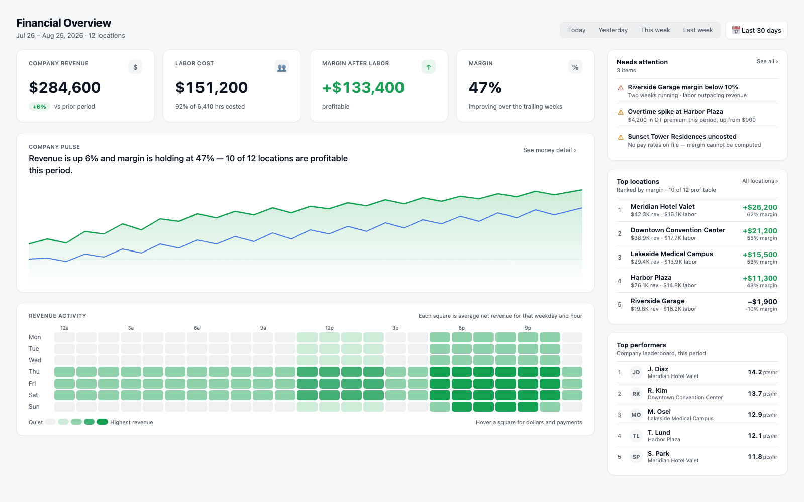
→The full layout: headline row, company pulse, and revenue activity heat map in the main column; needs-attention, ranked locations, and top performers standing in the rail beside it. Figures shown are illustrative.
Where Valletto changes the math
One screen for the money. A separate one for everything else.
The Financial Overview is deliberately narrow: revenue, cost, margin, and where each of those happened. It does not try to also tell you whether service was good this week - that question gets its own screen, its own drawer shapes, and its own guide.
Next: read the companion guide to Insights - the screen that answers how the operation is running, built on the same date-range model but reading operational signal instead of money.
