Feature Guide · Insights
Reading an operation,
not a ledger
A general manager opening Insights on a Monday morning isn't asking what they made last week. They're asking when they were busy, whether the floor was covered, who's carrying the shift, and what broke. Insights is built to answer exactly those five questions, in that order, and nothing else.
What it is
Insights is the operational read on a location. Money lives somewhere else on purpose.
Every Valletto location has two dashboards, and the split is deliberate. The financial dashboard answers "did we make money" - revenue, tips, cost, margin. Insights answers "how did the operation run" - demand, coverage, speed, and the team that produced it. Insights focuses on how the location ran, so your team can review operations without mixing that conversation with the financial dashboard.
The practical effect: a manager can hand Insights to anyone on the floor - a supervisor, a regional lead, a partner asking "how's the location doing" - without walking past payroll or revenue on the way there.
What you land on
One page, six sections, in the order a manager actually asks the questions
Five numbers above the fold, then five sections down the page
Insights opens on a location. Every location is scoped by a date range picker and, until you've chosen one, a table of your locations to click into first.
Row 1
The week in five numbers
Cars, Cars per valet hour, Busiest hour, Pull time, Park time. All five are clickable and open a drawer with the full breakdown.
Section 2
When you are busy
A demand heatmap by day and hour, with a coverage-gap callout when cars per hour outran the valets scheduled.
Section 3
The trend
Cars per day over the last 12 weeks, with a 7-day rolling average and a marked normal band - independent of the date range picker above it.
Section 4
What went wrong
An exception list - no-shows, late clock-ins and clock-outs, voided tickets, slow retrievals. Present only when there's something to show.
Section 5
The team
The same leaderboard document a valet sees on their own phone, with the ranking gaps a supervisor can act on.
Section 6
By stand
Cars in and out, park and pull medians, and busiest hour, one row per stand at the location.
→Nothing on this page opens a second drawer from inside a drawer. Every detail view is one click from the page, one level deep, and closes back to where you started.
Scope: which location, and which dates
Before you see a single number, Insights asks you to pick a location. After that, everything on the page (except the 12-week trend) is scoped to the date range you choose.
Location selection
Table, then a page- Land on a locations table if none is selected yet
- Clicking a location scopes the entire Insights page to it
- No cross-location rollup view - Insights reads one location at a time
Date range
Presets or custom- Today, yesterday, this/last week, last 7/30/90 days, this/last month
- A calendar picker for a custom range
- The trend chart's 12 weeks is fixed and does not move with the picker
→The date range subtitle under the page header always names the window you're looking at, and it's repeated at the top of every drawer so a number never gets read out of context.
The visual
What the page actually looks like
The full layout, top to bottom
Five KPI cards, the demand heatmap with its coverage-gap note, the trend chart, the exception strip, the team card, and the by-stand table - in that order, no tabs, no scroll-jacking.
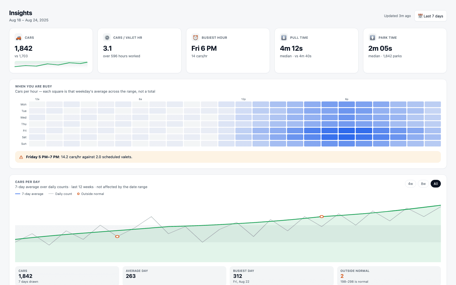
→Every card and every row in this layout opens the same right-side drawer pattern - one level deep, closes back to this page.
The daily loop
How a manager actually reads this weekly
Monday: check the exception strip and the coverage gap
The two things that name a specific problem you can fix this week live in the top half of the page.
"What went wrong" is a strip of pills, not a score. Each pill is a count of something concrete that happened - a no-show, a late clock-in or clock-out, a voided ticket, a pull that took over fifteen minutes - with a click-through to every occurrence: when, who, which stand, and (for slow pulls) how long. If the range was clean, the section doesn't render at all; "nothing flagged" is a real answer here, not a placeholder waiting to be filled.
Just above it, the demand heatmap can carry a coverage-gap callout: a specific day and hour window where cars per hour ran ahead of the valets actually scheduled. It names the window, the demand, and the shortfall directly - "Fri 5pm-7pm: 14 cars/hr against 2 scheduled valets" - so the fix is a scheduling decision, not a research project.
→Both of these are the "is something actually wrong" read. Everything else on the page is context for a decision, not an alarm.
Then: the busiest-hour drawer, when you need to prove the pattern is real
Clicking the Busiest hour card doesn't just repeat the headline number - it answers 'is that a fluke, or does this always happen.'
Top row
Cars per hour, valets scheduled, pull time
The three stats for the single busiest cell, with how many occurrences of that day the average is drawn over.
Below
Hour-by-hour for that day
Every hour of the busiest day of week, cars, valets scheduled, and pull time, with the busiest hour itself highlighted in the row.
→Clicking any other cell in the heatmap opens the same shape of drawer scoped to that hour, with the neighboring hours on either side of it for context.
The rest of the drawers: productivity, duration, cars, stand, member, and incident
Every clickable surface on the page opens one of these six drawer shapes. None of them opens a second drawer.
Productivity
Cars per valet hour
Location-wide cars-per-hour, total cars handled, and hours worked, then a 'who is carrying it' table ranking every valet who cleared the minimum hours floor - deliberately excluding a half-shift from outranking a full week.
Duration
Pull time and park time
One shared drawer shape for both: median, P90, and mean, a by-stand breakdown, and - for pull time only - a table of the slowest individual retrievals.
Cars
Total volume
Cars in, cars out, and voided tickets as a count, a cars-per-day bar chart, and a by-stand in/out table.
Stand
One stand's detail
Cars in/out, busiest hour, park and pull medians, the location's busiest hours for orientation, and the valets who mostly work that stand.
Member
One valet's detail
Hours worked, cars handled, cars per hour, pull time set against their stand and the location median, check-ins/check-outs, and attendance - no-shows and late punches.
Incident
One exception type
Count and (where relevant) average duration, then every occurrence: when it happened, who was involved, which stand, and duration for slow pulls.
→The member drawer's comparison is deliberately local: pull time is measured against the location for the hours that valet actually worked, not against the whole day - someone working a quiet 2am shift isn't slow, they're working a quiet shift.
Edge cases
What Insights does when there's nothing to say
Empty states are answers, not gaps
A 24-hour heatmap has a lot of legitimately empty cells, a clean week has no exceptions, and a slow valet in a quiet stand isn't automatically flagged.
Clicking an empty heatmap cell doesn't open a blank drawer - it states plainly that no cars checked in during that hour, on that day, in the selected range. A clean date range means the "What went wrong" section doesn't render at all, rather than showing a strip of zeros. And the productivity ranking has a stated floor: anyone under it appears in their own member drawer as "not ranked," with the reason given, instead of silently vanishing from a table.
What it deliberately does not do
Insights is not the financial dashboard, and it is not a live board
Three things this page will never show you
Each of these lives somewhere else in the product on purpose, not because Insights ran out of room.
No money
Revenue, tips, cost, margin
Not on this page, not in any of its drawers. A voided ticket used to show the dollars not charged; now it shows only the count. Money lives on the financial dashboard.
No score
'What went wrong' is an exception list
It's a count of named, dated, actionable events - not a health score or a letter grade. A manager decides what a no-show or a slow pull means; the page doesn't grade the location for them.
No vehicle positions
No live map of cars
There's no map here and no geofence anywhere in Valletto - no car has a position in the data model. What's live is the session board, a different screen entirely.
→The team section itself doesn't score or rank a person on Insights either - it reads the same precomputed leaderboard document a valet sees on their own phone, so a manager and their team are always looking at the same numbers.
Where Valletto changes the math
Insights is the operational half. The financial dashboard is the other half.
Together they cover the two questions every manager actually asks: how did the operation run, and did it make money. Insights never answers the second one, and the financial dashboard never tries to answer the first.
Next up: read the companion guide to the financial dashboard for the revenue, tips, and margin side of the same location - built to the same one-page, drawer-per-detail structure as Insights, on the other half of the question.
